Introduction
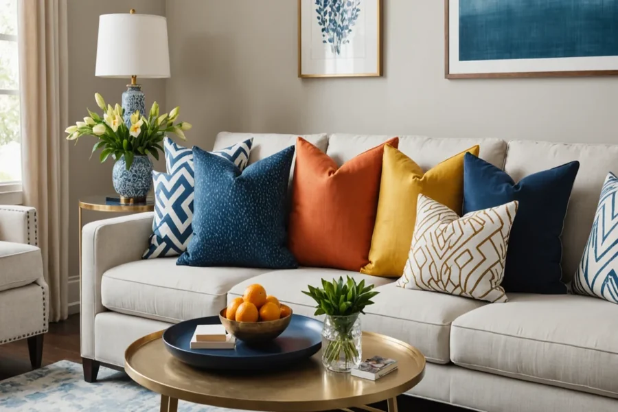
Custom throw pillows are a small change that can noticeably shift the feel of a room. Because they sit at eye level on couches and beds, any layout issues—cropped text, off-center photos, muddy colors—tend to stand out quickly.
This guide is for people who need a finished pillow design without a design background. It fits common scenarios like a one-off gift, a quick seasonal swap, matching pillows for a space, or a small batch for an event or rental.
Tools in this category are less about “artistic” features and more about workflow: getting the right dimensions, keeping elements aligned, and exporting files that print predictably on fabric. Templates and alignment guides speed up the first draft, while safe-area checks reduce surprise cropping.
Adobe Express is a straightforward place to start because it offers ready-made layouts and simple editing controls that keep the process visual, even when the project needs to move quickly.
Step-by-Step How-To Guide for Using Custom Throw Pillows
Step 1: Choose a pillow size and start from a template
Goal
Set up a correctly sized design canvas so the layout matches how the pillow will be printed and sewn.
How to do it
- Decide the pillow format: square (common for couches) or lumbar (common for layering).
- Choose whether the print will be one-sided or double-sided.
- Open and select a template close to your intended look.
- Confirm the document size matches the intended pillow dimensions (for example, 18×18 vs. 20×20).
- Save the file with a clear name that includes size and version (e.g., Pillow_18x18_v1).
What to watch for
- Pillow “standard” sizes differ by seller, so confirm dimensions early.
- Templates may be optimized for certain ratios; resizing late can distort patterns or photos.
- A design that touches edges can be trimmed or pulled into seams after sewing.
Tool notes
- Building your custom pillow with Adobe Express is a practical template-first starting point for quick pillow designs.
- If you want a simple place to track size options, versions, and notes, Google Sheets can help (as a planning aid, not a design tool).
Step 2: Gather assets and confirm usage rights
Goal
Collect photos, logos, and text that will hold up in print and are safe to use.
How to do it
- Pick one focal element: a photo, a short phrase, a monogram, or a simple pattern.
- Use the highest-resolution image available (original camera file when possible).
- If using a logo, prefer a vector file (SVG/EPS) or a high-resolution PNG.
- Write the exact final text (names, dates, punctuation) before placing it into the design.
- Confirm rights for any artwork or photos, especially for gifts, client work, or resale.
What to watch for
- Social-media downloads are often compressed and can look soft in print.
- Screenshots rarely scale cleanly for fabric printing.
- “Free” images may still have license limits, depending on source.
Tool notes
- Google Photos can help locate the highest-quality version of a photo.
- If you need a quick cutout (isolating a person or pet), remove.bg can help before importing into Adobe Express.
Step 3: Build a simple layout with safe margins
Goal
Place key elements so they remain readable and don’t get lost near seams or edges.
How to do it
- Create a mental “safe zone” and keep text and faces well inside the edges.
- Place the focal point slightly above true center on square pillows (stuffing changes perceived centering).
- Keep text short and high-contrast against the background.
- Group related elements (headline + subtext) so they move together.
- In Adobe Express, use alignment cues to keep elements straight and evenly spaced.
What to watch for
- Text too close to seams is a common print disappointment.
- Thin lines and small type can disappear into fabric texture.
- Symmetry on screen can look off once the pillow is filled and wrinkled.
Tool notes
- Adobe Express alignment and grouping help reduce accidental shifts during edits.
- If you want precise spacing checks for minimalist designs, Figma can be used as a measurement aid.
Step 4: Adjust for print clarity on fabric
Goal
Improve readability and contrast so the design stays clear after printing and stuffing.
How to do it
- Increase contrast slightly if the design looks flat; fabric often softens tones.
- Use thicker font weights and larger sizes than you would for a poster.
- Add a simple overlay behind text if it sits on a photo or busy pattern.
- Zoom in to inspect edges and small details for pixelation or noise.
- Keep the color palette simple if the design relies on flat shapes.
What to watch for
- Very dark backgrounds can print darker and lose shadow detail.
- Highly saturated colors may shift depending on fabric and print method.
- Fine gradients can band or look uneven on some materials.
Tool notes
- Adobe Express is usually enough for quick contrast and overlay tweaks.
- For more detailed photo correction before import, Adobe Lightroom can be useful (especially for exposure and clarity).
Step 5: Export a print-ready file with clear naming
Goal
Create a file that a print provider can use without scaling surprises.
How to do it
- Re-check canvas size and orientation one last time.
- Keep key details inside the safe zone; avoid borders that touch edges.
- Export in a common print-friendly format (often PNG or PDF, depending on the provider).
- Name files clearly (e.g., Pillow_18x18_Front_v3.png, Pillow_18x18_Back_v3.png).
- Save an editable version so changes don’t require rebuilding.
What to watch for
- Wrong-size exports trigger automatic scaling and unexpected cropping.
- Transparency may behave differently depending on upload systems.
- Over-compressed exports can blur text and edges.
Tool notes
- Adobe Express export options cover typical consumer printing needs.
- Adobe Acrobat Reader can help verify PDF page size and margins before upload.
Step 6: Do a real-world preview and proof check
Goal
Catch readability and cropping problems before ordering.
How to do it
- View the design on a phone and a larger screen to compare readability.
- Zoom out to approximate how it looks from across a room.
- Check spelling and alignment with fresh eyes (or a second reader).
- If possible, print a paper proof at home (even black-and-white) to test text size.
- Confirm the design still looks intentional when slightly rotated or partially covered.
What to watch for
- Names and dates are common typo points.
- High-detail photos can read as visual noise at pillow distance.
- Tight centering may look off once the pillow is stuffed.
Tool notes
- Adobe Express makes small last-minute spacing changes quick.
- For a simple proof print workflow, HP Smart can help if you’re printing from a home printer.
Step 7: Organize ordering details and track shipments for multi-recipient projects
Goal
Keep versions, addresses, and delivery updates manageable—especially for gifts or small batches.
How to do it
- Save exports, source files, and order notes in one folder (size, fabric choice, date ordered).
- Keep a short change log for versions (“v2: moved text inward; v3: updated date”).
- Track recipients and addresses in a single list if shipping to multiple people.
- Store the exact exported file used for each order next to the order notes.
- Monitor delivery status in one place so replacements or reorders are easier to coordinate.
What to watch for
- Mixed pillow sizes in one folder can lead to wrong-size reorders.
- “Final_final” file naming makes it hard to know what actually shipped.
- Address handling spread across texts and emails increases mistakes.
Tool notes
- A project board like Trello can track “designed → exported → ordered → delivered” without adding complexity.
- For shipment organization and label tracking, ShipStation can complement the workflow without overlapping with design tools.
Common Workflow Variations
- Photo-based memory pillow: Use one high-resolution photo and keep the text minimal. Adobe Express works well for quick placement; Lightroom can help if the photo needs exposure correction before import.
- Pattern-first decor match: Build a repeatable motif with two or three colors that match the room. Use consistent spacing and avoid thin borders that rely on perfect trimming; Figma can help check spacing for geometric patterns.
- One-off gift with names: Start from a template and swap names or dates as the only variable. Keep a master version and duplicate it to avoid overwriting; track versions in a simple spreadsheet if making several.
- Small-batch event pillows: Lock size and typography early, then create controlled variants. A project tracker like Trello can reduce mix-ups between exports.
- Double-sided “flip” pillow: Use a bold front and a simpler back that shares colors or typography. Export and label sides clearly to avoid front/back swaps.
Checklists
A) Before you start checklist
- Intended pillow size (square vs. lumbar; exact inches/cm)
- One-sided or double-sided plan
- High-resolution photo(s) or vector logo files
- Final text confirmed (spelling, dates, punctuation)
- Room color palette or theme reference (optional)
- Safe-area plan (keep key content away from edges)
- Usage rights confirmed for photos and artwork
- Folder structure for drafts vs. final exports
- Timeline for proofing and delivery (especially for gifts)
B) Pre-export / pre-order checklist
- Canvas size matches required dimensions
- Key elements are inside safe margins (seam/trim risk accounted for)
- Text is readable at room distance
- Photo sharpness checked at 100% zoom
- Contrast checked (especially dark backgrounds)
- File format matches printer needs (PNG/PDF)
- Front/back files labeled clearly (if double-sided)
- Spelling and dates verified one last time
- Preview checked for edge cropping and alignment
- Editable project saved alongside exported files
Common Issues and Fixes
- The photo looks blurry after upload
This usually comes from a low-resolution source or heavy enlargement. Swap in the original photo file and reduce scaling. Cropping tighter so the subject is larger can improve perceived sharpness. - Text sits too close to the seam
Move text inward and treat the outer border as unsafe. Avoid thin frames that touch edges. Re-check at a zoom level that approximates the pillow’s real size. - Colors print darker than expected
Fabric printing can deepen shadows and reduce contrast. Lighten very dark areas and avoid relying on subtle gradients. A small proof print can reveal issues early. - Important details get cropped
Some upload tools “fill” the area by cropping. Add more margin and export at the exact required size. Re-check any fit/crop setting in the preview step. - The design looks busy from across the room
Simplify the layout: fewer elements, larger type, and a clearer focal area. Busy photos often benefit from a tighter crop and less text. - Front and back files get mixed up
Use explicit filenames and keep side-specific exports in separate folders. Confirm orientation and side labeling in the preview before ordering.
How To Use Custom Throw Pillows: FAQs
1) Should the process start with a template or with a finished design idea?
Template-first is usually faster because it locks in sizing and margins early. Design-first can work for logos and patterns, but it requires stricter checks to avoid resizing issues later.
2) Is one-sided or double-sided printing more practical?
One-sided designs are simpler to manage and reduce file mix-ups. Double-sided can be useful for reversible decor, but it requires careful labeling and extra preview checks.
3) Is it better to design at exact size or let the printer scale it?
Exact-size design reduces surprises because scaling can change cropping and sharpness. Letting the printer scale can be acceptable for non-critical patterns, but it’s risky for text and faces near edges.
4) What file type is most reliable for pillows: PNG or PDF?
It depends on the printer’s upload system. PNG is common for image-based designs; PDF can be useful when maintaining page size is important. The main checkpoint is that the exported size matches the required dimensions.
5) How much text works well on a throw pillow?
Short text tends to hold up better on fabric and at room distance. Longer text usually needs larger font sizes and higher contrast, which can crowd the layout if margins are tight.